Monitor Calibration Made Simple for Clearer Visuals
Learn simple, step-by-step monitor calibration to improve color accuracy, contrast, and sharpness for clearer visuals in work, gaming, and media.
Why Calibration Matters
Monitor calibration is the foundation for clearer, truer visuals across computers and consumer electronics. When a screen is out of tune, shadows can crush, highlights can clip, and colors drift from their intended hues, undermining everything from everyday browsing to professional design. Accurate color accuracy improves readability, reduces eyestrain, and ensures that what you see is consistent across devices. Whether you game, edit photos, review product shots, or watch movies, calibration aligns your display with a trusted color space so content appears as its creator intended. Most web content targets sRGB, while some creative workflows use wide gamut modes. Correct gamma and white point create neutral grays and smooth tonal transitions, letting you judge exposure and contrast with confidence. Calibration also clarifies differences between SDR and HDR content, avoiding exaggerated saturation or dullness. Ultimately, a well-calibrated display removes guesswork, allowing decisions to be based on reliable visuals rather than compensating for a screen's bias or inconsistent defaults.
Set Up Your Space and Screen
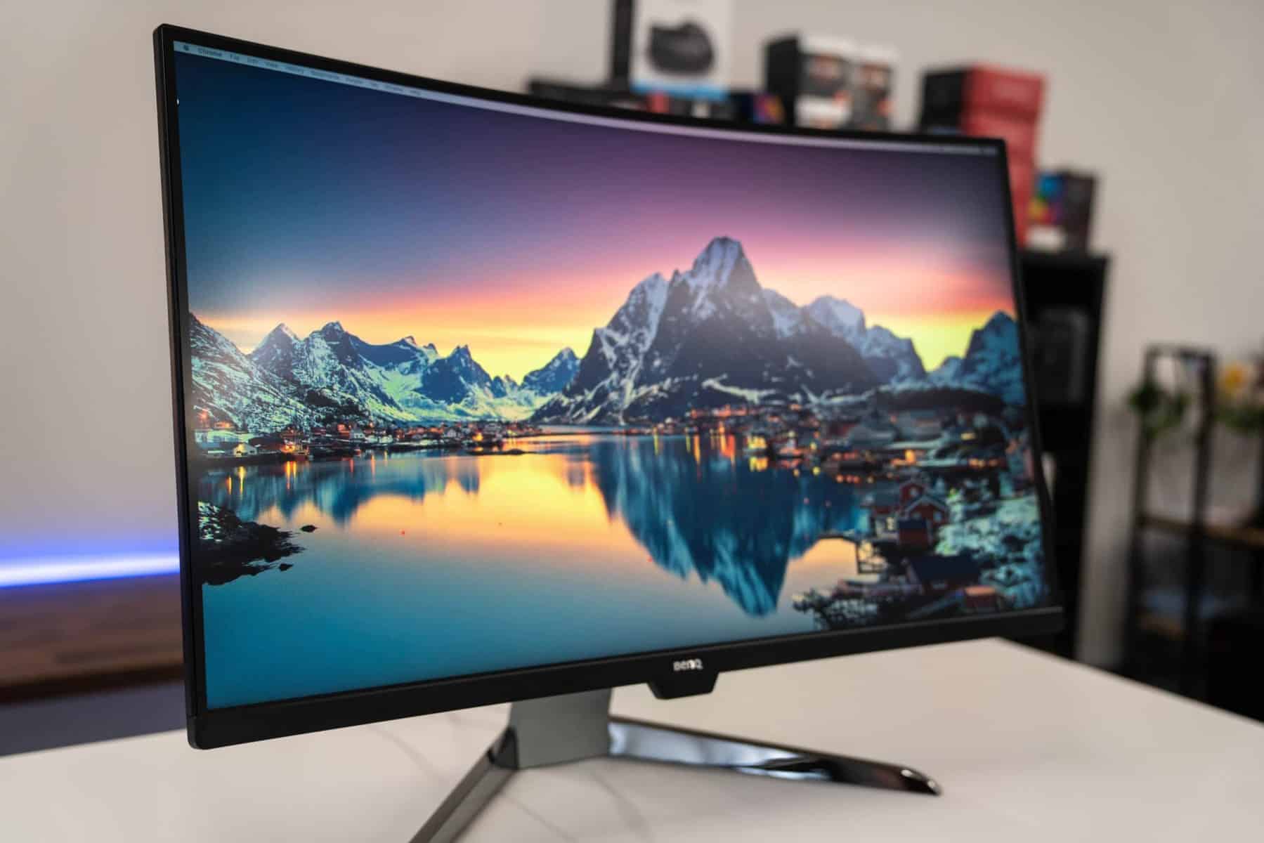
Great calibration starts with a stable environment. Control ambient light so it's consistent, moderate, and free of harsh glare. Position your monitor to avoid reflections, and clean the panel to prevent false judgments about sharpness or tint. Let the display warm up so backlight and colors stabilize. Use the native resolution and an appropriate refresh rate, and connect via a high-quality digital cable to avoid signal issues. Disable aggressive image processing such as dynamic contrast, local dimming (in SDR work), or auto brightness while you calibrate, because these features can shift targets mid-measurement. Set color temperature to a neutral preset (often close to D65) and choose a standard gamma setting. If your display offers uniformity compensation, test whether it improves consistency across the screen. Reduce visual clutter on your desktop, prefer neutral gray wallpapers, and keep bright accent lights out of your field of view. With the room tamed and the display stable, your adjustments will be more accurate and repeatable.
Manual Calibration, Step by Step
You can get surprisingly far using only on-screen controls and well-made test patterns. Start by adjusting brightness (black level) until the darkest patches are just visible above true black, avoiding crushed detail. Next, set contrast (white level) so bright tones are crisp but not clipping; subtle highlight steps should remain distinct. Return sharpness to a neutral middle value to avoid artificial halos. Select a neutral color temperature and standard gamma. If available, fine-tune RGB gain (for highlights) and bias or offset (for shadows) to remove color casts from grays; aim for a neutral tone across a grayscale ramp without tint shifts. Check gradients for smoothness to minimize banding, and confirm that skin tones and neutral objects look realistic. Save these settings as a baseline on the monitor's OSD. While manual tuning cannot map a complex color gamut perfectly, it establishes sound luminance, contrast, and neutrality so software profiling can finish the job more precisely.
Leverage Tools for Precision
For the most reliable results, use a colorimeter or spectrophotometer with calibration software. These tools measure your display's response and build an ICC profile that characterizes its behavior. The software then loads corrections into a LUT in your graphics pipeline or, on capable models, into the monitor's internal 3D LUT for hardware calibration. Choose targets that suit your work: an sRGB or similar color space, a white point near D65, a midroom luminance suited to your lighting, and a consistent gamma. The workflow typically measures grayscale, primaries, and secondaries, then creates a profile that color-managed applications use to render accurate hues. Advanced monitors may support multiple calibrated presets, letting you switch between SDR and wide-gamut modes. Laptops benefit greatly too, as factory tuning varies. This approach minimizes metamerism issues, reduces rendering errors, and provides repeatable accuracy, especially when you validate results and confirm that average errors remain comfortably low across tones and hues.
Maintain, Apply, and Verify
Calibration is not a one-time task. Displays drift and environments change, so recheck settings periodically to keep consistency. Assign the generated ICC profile to the correct display in your operating system's color management panel, and ensure it loads at startup. Calibrate each monitor individually; then match luminance across a multi-screen setup so windows moved between screens retain similar brightness and contrast. Verify with a validation run, reviewing metrics such as grayscale neutrality and color differences, and inspect real images for practical confirmation—skin tones, product photos, and neutral materials expose errors quickly. If you work between HDR and SDR, keep separate, clearly labeled presets and avoid mixing modes. Be mindful of power-saving features that alter backlight behavior. For print-oriented tasks, use soft proofing in compatible apps to preview how profiles interact. By maintaining profiles, validating, and making small environment tweaks, you preserve clarity and trust in every visual decision you make.